A Modern-Day Relic


Yes, I’m a relic. But that’s not what I’m writing about. (We may get around to that later, time permitting of course.)


Relics serve the useful purpose of reminding us of people, places, or times past.

The year 2019 was memorable, worthy of a relic. My sister and I explored our family history in London, walking the streets and visiting the sites where our ancestors lived going back to our great-g-g-g-g-g-grandparents. And that’s just on our father’s side; on our mother’s side we visited family neighborhoods inhabited by our great-g-g-g-g-g-g-g-g-g-g-grandparents.

The year was also memorable for seeing the publication of my book Footprints, which explored the history of these English ancestors.

So I couldn’t let the year lapse without marking its significance. I wanted a “relic” that honored our visit to London, our English ancestors, and my book publication. A relic that was English, old fashioned, and had a connection to writing.

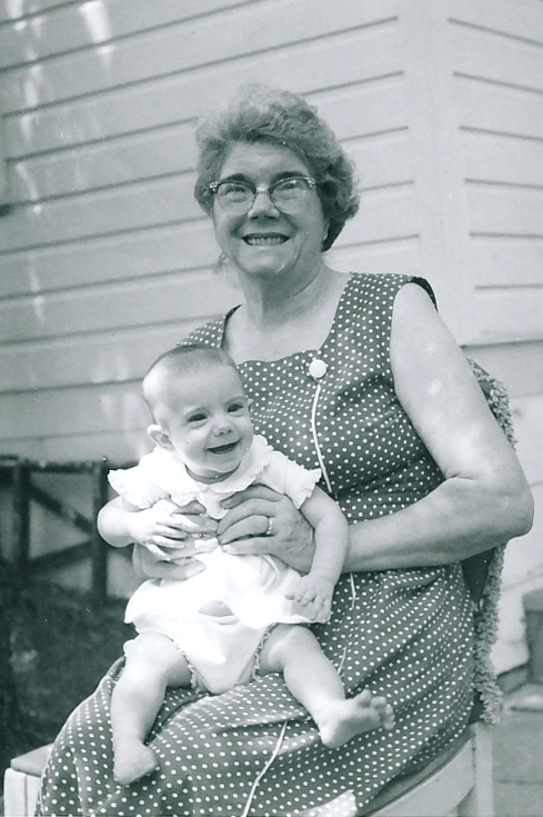
The solution: an English fountain pen. And I found one with a brand name that stretches back to the years my grandmother, who was born in London, lived there. A pen with a technology our grandmother would have used in her school which we visited. A pen I can use to make notes for my follow-on book.
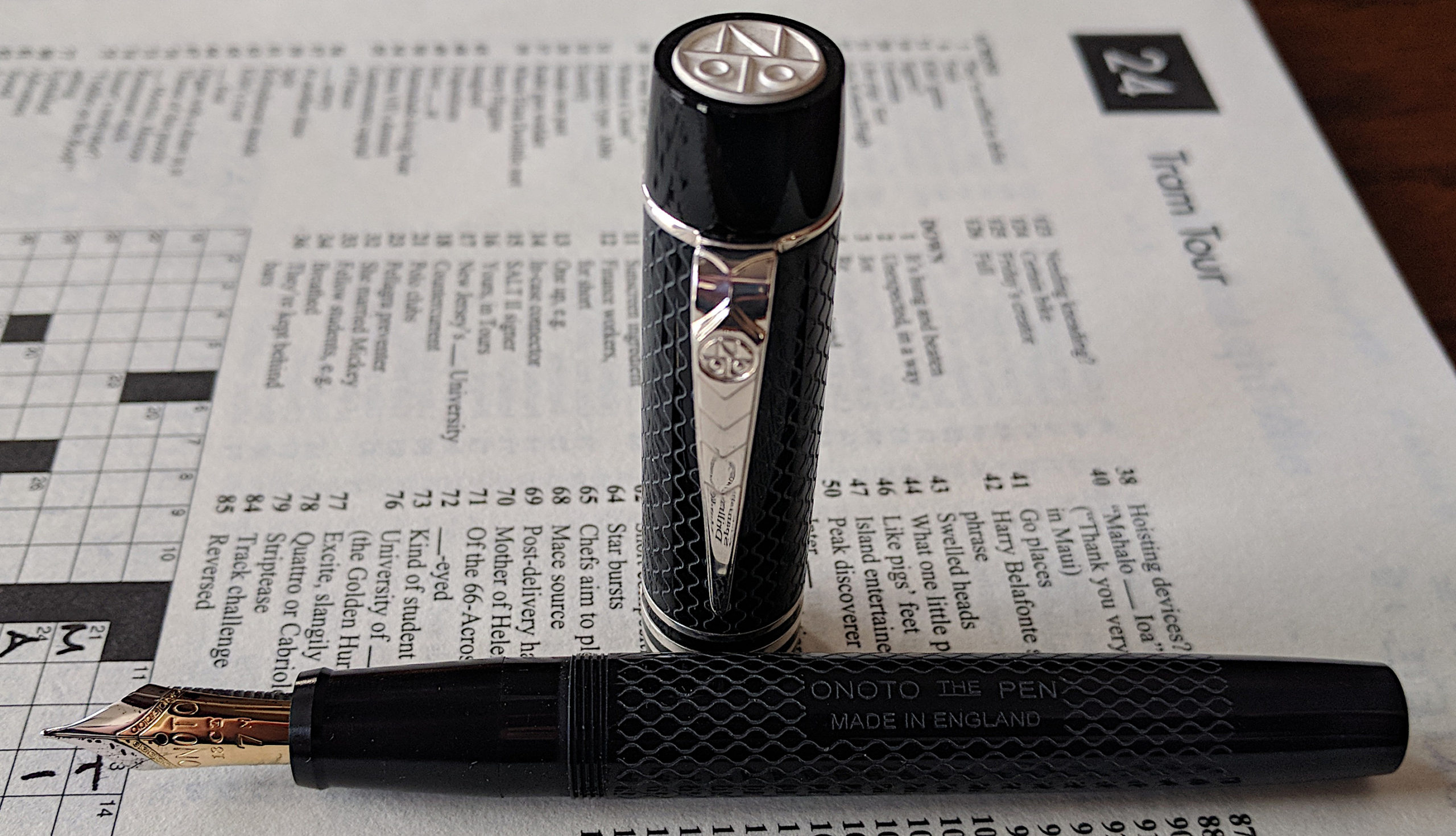
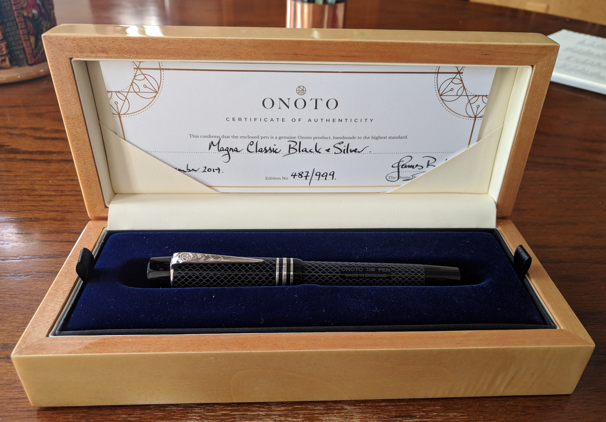
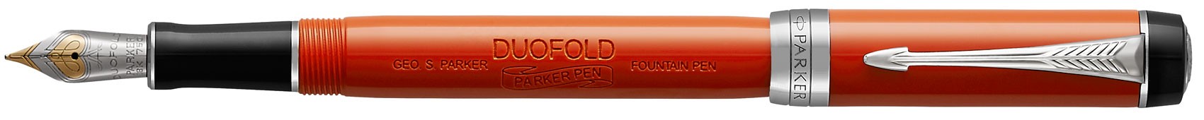
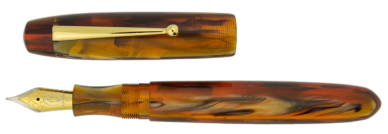
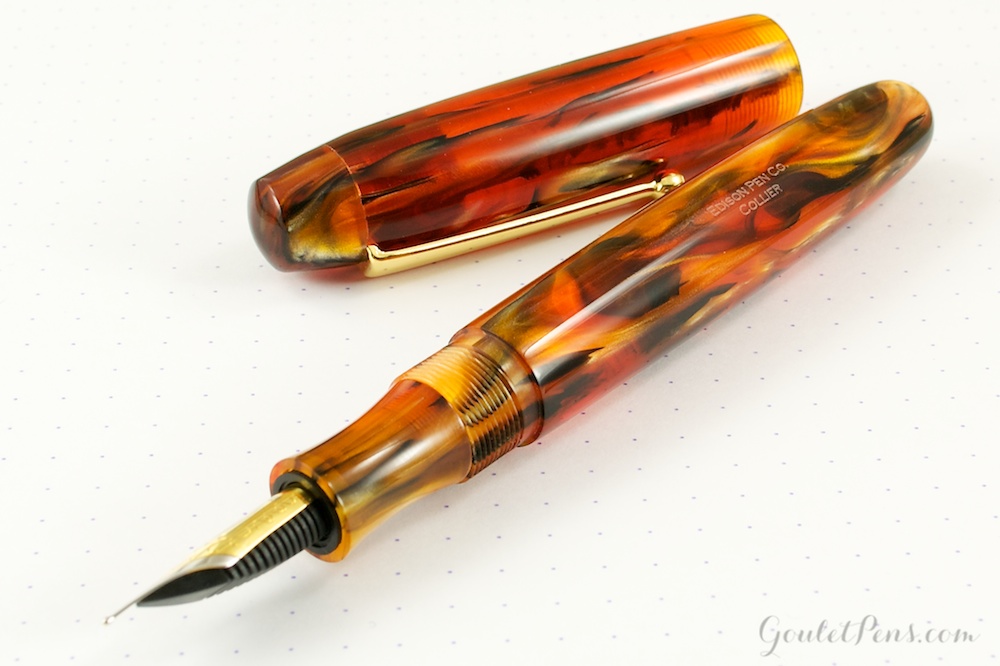
The pen is an Onoto, or as its engraved barrel says, “Onoto the Pen”.

The Onoto Magna Classic — uncapped

Since I like to name my fountain pens after figures in my family, I’ve named mine “the Estall.” The pen will commemorate the seven generations of Estalls who inhabited London as tallow chandlers, silk weavers, dock workers, general labourers, and lastly as orphans.

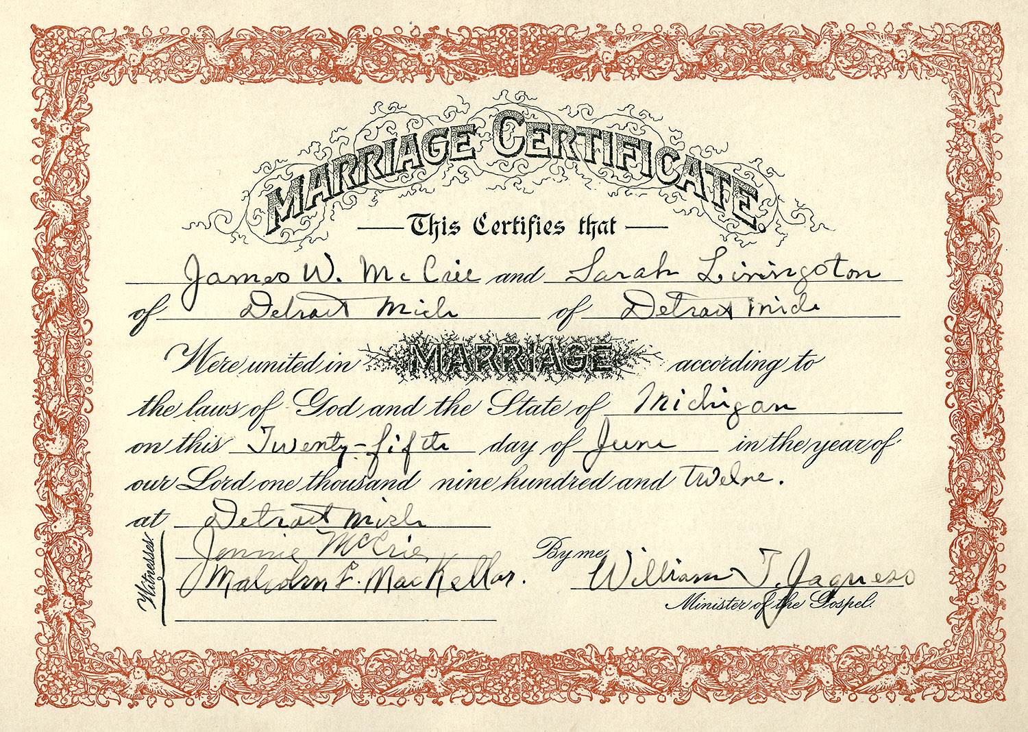
Onoto pens got their start in 1905, a year before our grandmother’s emigration to Canada. The London-based company De La Rue started making fountain pens in 1881, predating her birth, and in 1905 they began making the first self-filling fountain pen guaranteed not to leak, which they dubbed the Onoto, in their factory on Bunhill Row in London, not far from where our great-grandfather was born.

My pen doesn’t go back that far, of course. It was born on 12 December 2019. And though it uses an outdated technology (really, who uses fountain pens these days?) it writes far better than modern-day biros (that’s ball-point pens to us Americans). The model I bought, the Magna Classic, is styled after an Onoto model designed in 1937. It may look dated but that’s kind of the point — it reminds me of olde London. It is, after all, going to be my “relic.”

A history of the company and its pens is available at A Brief History of Onoto Pens, the De La Rue heritage site, or the Onoto web site.

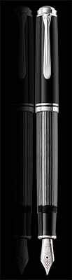
My black and silver Magna Classic has a chasing pattern engraved in its cap and body. My other black pen, a Montblanc 149, is rather plain and stodgy, whereas the chasing on the Onoto gives it some character. In place of Montblanc’s snow-capped top, the Onoto has a carved silver company logo, giving it a unique vibe, if not the prestigious brand recognition of a Montblanc. The pen has flat ends rather than than the rounded ends of the cigar shaped Montblanc, and I’m partial to the flat design which my favorite pen brand Pelikan also uses.

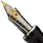
The Onoto and Montblanc both have 18 carat gold nibs. I like the size of the Montblanc’s nib, which is massive, but truth to tell, the writing experience with the Onoto is better. The Montblanc was a pretty terrible writer until the nib was tuned by a professional; the Onoto on the other hand wrote perfectly right out of the box, as smoothly as butter sliding over a hot  English muffin. Perhaps that’s because the nib is wet and writes more like a broad than a medium.

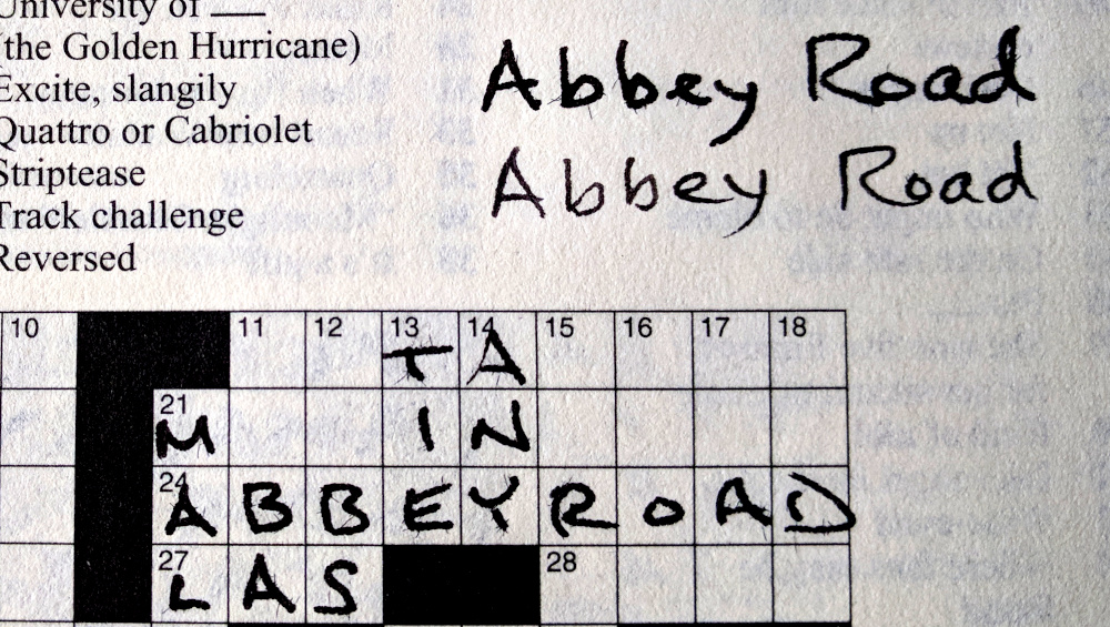
The other cool feature of the Onoto is that its nib is a “duo point,” which puts down a medium (I’d call it medium broad) size line when writing in the nib-side-up position and a fine line when the nib is turned over in the feed-side-up position. It’s like having two pens in one. I use the medium side for journaling and notes, and the fine side for entries in my small date book. Medium for daily crossword puzzles, fine for the smaller squared Sunday puzzles. You get the idea.

“Abbey Road” written using the upright medium nib position above followed by the reverse fine nib orientation below.

The Onoto Magna Classic is considered a luxury pen, similar to the Montblanc, though not quite as expensive as its German cousin. The Onoto has hallmarked sterling silver furniture — clip, rings, and buttons on the cap and barrel — as well as a gold nib. Unlike the Montblanc’s piston ink filling system, the Onoto uses a converter, which reduces its cost, though one can buy an optional plunger filler, bringing it more in line with the Montblanc price tag. I’m perfectly happy with a converter system that will prove to be easier to maintain and/or replace over the years.

The Onoto pen is a good size. It’s the same size as a Pelikan M800, which some pen connoisseurs consider the ideal size for a pen. The Onoto has the advantage of a longer grip section, keeping the threads away from fingers. The Onoto’s moderate size also makes it easier to write with than, say, the Montblanc 149 oversize pen.

Our Estall ancestors were not perfect. Nor is my Estall pen. A minor downside is the threading which attaches the cap to the barrel. Most pens are secured with one (Pelikan) or two (Montblanc) rotations of the cap. The Onoto takes four. That could be an issue for a student who is capping and uncapping her pen while taking frequent class notes. By the time the cap comes off, the history professor may be halfway into the next century. But for me who usually writes in longer sessions, cap rotations are not an issue. As a family historian I might even speculate there’s an advantage to stories written with more turns of the screw.

Another criticism I’ve read of the pen is its light weight. I didn’t think that would bother me, but based on pen reviews I ordered the optional brass weight in the pen barrel, and my Onoto’s barrel is now the same weight — 21 grams — as the Pelikan M800 barrel. Ideal size, ideal weight.

Burl wood presentation box, including the pen’s “birth” certificate in the lid

Although I don’t put much stock in packaging material, I’d be remiss not to mention the eye-catching, highly polished solid burl wood box the pen came in. It’s relic-worthy in itself and something I’m likely to keep on my desk for years to come.

I’ll always have a soft spot for the year 2019. And now I’ll always have my “Estall” pen to remind me of our trip to London, of our ancestors, and of the year that I connected with them in a very tactile way.

An Ace Up Her Sleeve

In my pre- and early teen years I spent my summers with my grandparents at their cottage on Halfmoon Lake in Michigan.

Bessie with a granddaughter in 1959

Most evenings my friends and I played canasta with my grandmother Bessie. She was in her element— animated, competitive, joking, story-telling, and smiling. Those evenings spent playing cards at the table in the knotty pine-paneled dining room are probably the clearest images I have of her, and they are wonderful warm memories.

I’ve covered Bessie in a few previous posts on this blog. This time, I’m introducing the pen I’ve named for her, and it’s a jolly good match.

The pen is the Parker Duofold Centennial “Big Red.” It’s name and color harken back to pens the company made in the 1920s, the premier pen in their lineup at the time. And it’s still the flagship pen of the modern incarnation of the Parker Pen Company.

The Parker Duofold Centennial “Big Red”

The nib of the pen is engraved with an ace of spades. There couldn’t be a better homage to Bessie than a pen that when capped literally has an ace up its sleeve. Bessie would have loved the symbolism. She occasionally joked that one of us was holding one up ours when a card game was going against her. Conversely we’d tease her when she gleefully laid down a run of high-scoring aces.

The vivid color of the pen reminds me of Bessie’s outgoing personality. She loved to be around people and she enjoyed being the center of attention. Most of my pens are staid, but this one is eye-catching. Bessie would have approved.

Interestingly, the pen company seems to trace the arc of Bessie’s life migration, albeit in reverse. Bessie was born in England, of a family she was convinced was of French extraction. In her mid teens she relocated to Canada. Five years later she moved to America to marry my grandfather, and spent her adult life there.

By contrast, the Parker Pen Company was born in America (in 1888, three years before Bessie), established one of their plants in Canada, and moved their company headquarters and manufacturing operations in the late 20th century to England. In 2011 the company again moved its headquarters and pen production, this time to France. This reverse arc can be seen as complementing or even closing the circle of Bessie’s own journey through life.

So now that I have Bessie in hand, how does she stack up with other pens in my collection? Well, given that the Parker Duofold falls into about the same price range as the Pelikan M800 series pens, and that its length and girth are similar to the M800, and that they both have 18 caret gold nibs, I’ll limit my comparison to those two pens.

Bessie fits well in the hand as does the Pelikan M800, which many people consider to be an ideal size. She has a longer grip section which gives her a bit of an advantage over Pelikan’s surprisingly short section, though both are comfortable for writing.

Bessie is an eye-catching color and gets points for splash. She’s engraved with old-style Parker Duofold branding on the barrel that echoes predecessors from the 1920s, giving her a retro, classy look. Between her color and her styling she has both sass and class, much like her namesake. The Pelikan is more classically styled by comparison, but is the epitome of refinement and design. Looks wise, I call it a toss-up.

Bessie has a cartridge/converter ink supply system. This is where she looses points to the Pelikan, which uses a piston-fill ink system. The converter holds less ink, is noticeably lighter in weight than a piston filler, and doesn’t have the same robust construction as the Pelikan. Some people might like a lighter pen, but I like the heft of the Pelikan and the balance the extra weight provides. I also find the Pelikan to be easier to fill.

Pens are not normally rated on sound, but I can’t help but notice the difference in both pitch and volume when capping and uncapping the pens. Weird, huh? Bessie sounds metallic and tinny when waking her up or putting her to bed; the Pelikan is extremely quiet, and what little noise it makes is low pitched when threading or unthreading the cap. Bessie’s high-pitched voice may lead to the impression she is less solid and uses lower quality materials than her avian brother, though I have no way of knowing if that’s true.

The 18-karat gold nib, made in-house by Parker, is a smooth writer and worked well right out of the box, something that not all of my pens have done. (Two of my three Pelikan pens required some polishing and tuning to achieve a good writing experience.) The Parker’s broad nib lays down a wet, smooth line with absolutely no pressure required. It rarely skips or hard starts, making it a solid writer. Pelikan pens also make their own nibs in house, and they too are reliable writers. On the whole, the nibs are very similar, both in size and performance. The Pelikan’s broad nib makes a somewhat finer line and provides a bit more feedback than the Parker, making the writing sharper and cleaner. Whether the smoother, wet line of the Parker or the sharper, drier line of the Pelikan is preferable is a matter of personal taste. I like them both.

Bessie’s nib has a unique profile: the feed on the back of the nib doesn’t have fins like other pens in my collection. This gives Bessie a slimmer, flatter nib profile, something that the human Bessie would have envied. (Does this nib make me look fat? No? Whew!) The lack of fins doesn’t affect ink delivery to the paper—it’s a juicy writer. Her profile is another way Bessie stands out from the crowd.

The pen is expensive, commensurate with it’s flagship status, but can be obtained from overseas sources at about two-thirds of the U.S. asking price. I bought mine at Appelboom  (in the Netherlands) on Fountain Pen Day and received a 17% discount. During the rest of the year one can use the “friend” discount code to get a more modest 10% off. Another benefit of buying overseas is that the nib selection is wider, coming in Extra Fine, Fine, Medium, and Broad points whereas American retailers offer only Fine and Medium nibs. I got the broad nib to make my Bessie unique from her American cousins and to give my writing some flair. After all, I wanted to keep the pen’s personality in line with my grandmother’s.

The pen is a nice addition to my collection, something to pick up when I’m looking for a little color in my hand or pocket, or if I just want to think about Bessie and break out in a smile. It’s my “ace up the sleeve.”

(As an aside, I recently came across an email in which my cousin recollected Bessie “telling her that in the orphanage in London [where Bessie spent six years] they ate oatmeal for breakfast, got a cube of brown sugar to put on top, and that she would wrap the sugar in her hanky for a treat later in the day.” I like that story. A child can find comfort and happiness in the simplest of things, even in the face of adversity. I need to embrace the child in me more often.)

The Wellington

I probably owe my fascination with fountain pens to James Wellington McCrie.

My grandfather was an accountant and he kept a stash of dipping pens and spare nibs in his desk drawer. I grew up in his house and frequently rummaged around in his desk. He didn’t mind; he’d passed away nine years before I was born.

Owen School, built 1879, ca. 1890

I went to the same elementary school as he did. When I attended it was the oldest school in Detroit. The desks still had ink wells. My older sister remembers using them, but by the time I began cursive writing the ballpoint had replaced the dipping pen in the classroom.

Nevertheless, exposure in my youth to the ink wells and to my grandfather’s cache of pens stirred thoughts of using a fountain pen when I was in college and I bought a cheap one with ink cartridges. I didn’t use it long—it leaked like a sieve and made a mess of both my paper and hands.

Years later I got a leather holder with a nice pen and pencil as a gift from co-workers. There was a different feeling to extracting those writing instruments from their pouch than with grabbing a Bic pen from the drawer. Maybe it was similar to the way one feels when putting on a suit and knotting a tie rather than pulling on jeans when going out to dinner: a feeling of anticipation, deliberation, mindfulness, sophistication.

Later still I attended a seminar where one of my classmates had a Montblanc ballpoint pen. It was the first time I felt pen envy; I was determined to have one of my own. I bought a Montblanc knockoff (i.e., fake) pen from a street vendor in New York. Unfortunately it just wasn’t the same—like wearing a tee shirt with a bow tie print to a formal affair—and I didn’t use it long, nor did I ever take it out of the apartment.

I reconnected with fountain pens when my wife and I visited her cousin in Los Angeles a couple of decades back and we were introduced to a friend of hers. Her friend worked as a district sales manager for Montblanc and she enthused about her personal fountain pens. She hooked me up with a deal on a Meisterstück fountain pen, and writing has never been the same. It’s tactile and pleasurable: deliberate, mindful, sophisticated.

Which brings me back to James Wellington McCrie. I’m naming one of my favorite fountain pens for the man who started me on this writing journey.

Pelikan M805

The pen I have in mind is a Pelikan Souverän M805 Stresemann. The pen’s striped gray barrel was designed after the suits worn by the Weimar Republic’s foreign minister Gustav Stresemann (1879-1929), a contemporary of my grandfather’s.

The design gives it a “buttoned down” look that would have been appreciated by my accountant grandfather. Pictures I have of him show he was a conservative dresser — yes, he wore a real bow tie — and this pen would look great in an accounting office, or any office for that matter. Its black and gray tones are matched with palladium plated clip and rings, and a rhodium plated 18-carat nib. The pen exudes understated sophistication.

The German-manufactured pen is a piston filler that holds a good amount of ink. When I reflect on my college years’ experience with a leaking cartridge pen, this would be its opposite — it fills easily and cleanly and writes without mishap or misstep. It’s fine-tipped nib would work nicely for an accountant filling in columns of numbers, but I eventually swapped it out for a broad nib more suited to writing lines of flowing text and signatures. That’s one of the strengths of the Pelikan brand, you can interchange the nibs among similar models.

Unfortunately, the pen is not as cheap as the knockoff Montblanc I snagged in New York. However, using the frugality inherited from my Scottish grandfather, I bought it from an on-line retailer in England — Cult Pens — which offers Pelikans at considerable discount over American pricing, especially when the exchange rate is favorable.

Peter Twydle, author of Fountain Pens: A Collector’s Guide, writes, “The one question people ask me more often than any other is, ‘What is the best fountain pen in the world?’ My answer is always Pelikan and, more specifically, the Pelikan M800 and its variants.” I can’t disagree with him. This pen writes beautifully. It fits comfortably in the hand. And with its beak-shaped clip, distinct pelican logo on the finial, and beautifully engraved nib, it is extremely handsome.


So just who was this James Wellington McCrie I’ve named my pen after? That’s a good question because I never met him, and his wife and daughter didn’t talk about him. His portrait was on the fireplace mantel, but he might as well have been a ghost. So here’s what I’ve found, and I have to say I’ve grown to like him.

James in 1878 in Grand Rapids

He was born in June of 1878 in Grand Haven, Michigan, to James and Anna (Anthony) McCrie. He was apparently named for his father but given a distinct middle name — a name that doesn’t have precedence on either his father’s or mother’s side.

When James was two years old his father was working as a foreman at the railroad’s grain elevator in Grand Haven along the Grand River. Leading a rather comfortable life, the family lived within a short walk to the river or a twenty-minute walk to Lake Michigan. His father apparently was well regarded, for two years later, in 1882, the family moved to the city of Detroit where his company had just completed a grain elevator in the rail yards on the Detroit River and his father was given the job of weighmaster. James was four years old.

Detroit Business University, 1894

Four years later the family moved to a house on 14th Avenue, where James attended the nearby John Owen Elementary School. His public education continued through the eighth grade; after that he attended the Detroit Business University for between six and twelve months to complete the business curriculum, taking courses in business writing (including penmanship of course), business arithmetic, bookkeeping, commercial law, business correspondence, and business paper (invoices, contracts, leases, mortgages, deeds, etc.).

James McCrie’s signature on a 1918 draft register shows a sample of his penmanship

The education stood by him well as he worked his way up from clerk, assistant bookkeeper, bookkeeper, paymaster, accountant and cost accountant over the course of his career in various businesses around Detroit.

He began at age 17, working as a clerk at Michigan Carbon Works, a stone’s throw from the Detroit River where today Cobo Hall is located. At age 21, in 1899, he was working as an assistant bookkeeper at Wm. H. Elliott, a store selling clothes and dry goods on the corner of Woodward Avenue and Grand River. The handsome 6-story red brick Elliott building still stands on the northwest corner of the intersection.

Four years later he was working as a bookkeeper at Crown Hat Manufacturing Company. He worked there for six years, and I believe it was while he was there, in about 1905, he met his future wife, Sarah Livingston, who was working as a stenographer at a millinery (hat) wholesaler a few blocks away in downtown Detroit. The couple put off marriage for seven years while Sarah was living with her elderly mother and young orphaned cousins. She wanted to delay starting her own family until the cousins were grown.

From an advertisement of 1909

In 1909, at age 31, James was a bookkeeper at Everitt-Metzger-Flanders. The company, more commonly known at E-M-F, was the fourth largest automobile manufacturer at the time, with Henry Ford’s company being the largest. Ford’s small factory, now a museum, was on the neighboring block on Piquette Avenue.

James would have shouldered his way to work in the heart of the fledgling auto industry amidst a stream of factory laborers on the streets, with machinists, engineers, inventors, and automobile tycoons bustling about. From his office he’d hear the thrump of machinery, the grunts of men, the cranking of engines, and the whistles of trains arriving with parts and departing with new cars. It was a time of energy, competition, and excitement in Detroit, centered in the neighborhood where he worked.

In 1910 Studebaker took over E-M-F and expanded the plant into Henry Ford’s factory when Ford moved his operations to Highland Park. (Interestingly, Studebaker ran its cars through Henry Ford’s old office at the front of the building on their way to the rail head.) James McCrie became an accountant with Studebaker that year. When the head of the company started up the Maxwell Car Company three years later, in 1913, James moved with him and became the paymaster at Maxwell.

Click on certificate to see enlarged image and guest book

It was a time of excitement in James’s personal life as well. He married Sarah Livingston in 1912 when he was 34 and she was 36 and in a couple of years they moved into a house on 14th Avenue a block from his mother’s.

They started their family quickly, with son William born in 1914; daughters Margaret and Jean followed in 1915 and 1917 respectively.

James W. McCrie with son William and mother Anna, wife Sarah, and sister Jennie (seated), 1914

With his new family established, James changed jobs again in 1918, becoming a bookkeeper and accountant for a pair of attorneys on the 14th floor of the Ford Building in downtown Detroit, a skyscraper of its day and a building that still stands. He was only there shortly though; the next year, at age 41, he started working for a lithographic company, Calvert Lithographing, on Grand River Avenue. He became a cost accountant for the prosperous and long-established firm; the job was solid, supporting the family through the Great Depression of the 1930s.

James Wellington McCrie (without jacket) in his side yard next to cousin Florence and friends ca. 1928

From photographs of James we know he was bald at an early age, overweight, a bit stiff, and almost always wore a tie. He seems to have had a sense of humor, but one he kept in check. Accountants are generally known to be conservative, conscientious, rules-based, and unimaginative in their work, and James looks like he fit the bill, right down to his socks.

James McCrie the father and gardener ca. 1917

Pictures show he worked a flower and vegetable garden in his back yard, and he had a chicken coop as well. He rented out the upper story of his two-story home, a common practice of that day and area. His bank book showed he religiously put money into savings, even during the years of the Depression, so he must have known how to manage his own as well as company funds.

Though he looked self-possessed in all of his photographs, my sister tells the story that he became so exasperated with his headstrong daughter (my mother), he once took her by the heels and hung her down the clothes chute when she misbehaved. He apparently wasn’t as unflappable as photographs suggest. (Clothes chutes were much bigger in those days. I used to sit in it and play astronaut during the early space exploration years.)

By his early 50s James’s love of ice cream and his sedentary job may have contributed to his developing chronic myocarditis and nephritis, which felled him at the age of 62. Bed-ridden in his last months, he died at home on the day his son was married in October of 1940.

James Wellington McCrie’s mantel portrait

I wish I’d had the chance to know him.

I also wish I’d had the foresight to keep at least one of his pens.

Instead, I have to settle for naming one of my favorite pens for him, thinking of him when I pick up the conservatively dressed Pelikan Stresemann. I call it ‘The Wellington’ in his honor. I think it’s an apt name.

A Mother’s Touch: the Edison Collier Pen

Some pens are easy to name — a Montegrappa pen with ‘1912’ embossed on it screams my father’s name ‘Leonard’ as he was born that year. An oversized Pelikan pen can easily be tagged as the ‘Big Mac’ to honor a McCrie great-grandfather.

The pen I’m naming after my mother, though, doesn’t visually bring her to mind. The Edison Collier in my collection is brown, whereas my mother was fair skinned with blue eyes. It is a large pen, and my mom was short. It has a blunt stub nib, not at all reflective of my mother’s well-rounded, easy-flowing friendliness.

But in the hand the pen’s resin is silky soft and the pen’s shape is exceptionally comfortable, and that tactile feel is what reminds me of my mom, a presence so warm and natural that it whispers her name. And so my Edison Collier pen has been named ‘Jean.’

Jean McCrie (later Schutze) ca. 1940

Admittedly I wanted a better hook to tie her to the pen. And there is one, though it’s a bit of a stretch. The Collier is made in Milan, Ohio, the birthplace of Thomas Edison. The Edison Pen Company was named after the town’s legendary inventor, who was born on February 11, 1847. My mom’s birthday was also February 11th. Not exactly a slam dunk match, but a strong enough link to validate the connection between Jean and this pen.

The pen feels so good in the hand I use it every day, often to fill in a crossword puzzle or make the day’s to-do list over breakfast. But like my mom, the baby of her family, it can be temperamental. First, a stub nib is not quite as easy to write with as a rounded point nib, though it is by no means difficult. Offsetting the stub nib’s impishness, though, is the sass and personality it gives to one’s handwriting, which assets my mom had in abundance and would have appreciated.

However, an annoying trait was the pen’s ink flow problems, which caused difficulties in starting after uncapping and in running dry while writing. I tried wetter inks to no avail. I initially had a medium point nib and I replaced it with a stub, again to no avail. I flushed it several times with water and a cleansing solution and it still ran dry. Finally, I pulled out the converter and inked the barrel with an eyedropper, and that did the trick. It writes marvelously now, and with the barrel’s large capacity, it shouldn’t have to be re-inked any time soon. Admittedly, the ink flows so well now it tends to leak a bit into the cap, giving me ink-stained fingers when writing with the pen.

As a nod to my mother, I typically use blue ink in the pen to mirror the color of her eyes. I’m currently using Pelikan’s Edelstein Topaz which is a nicely saturated light blue.

The Collier boasts a classic design in a light-weight, reasonably priced (around $150) steel nib pen. The brown swirl in the resin is eye-catching, and the light bulb etched on the nib is a nice nod to its place of origin. More impressive than looks, though, is how its resin feels so smooth, how its considerable girth rests nicely in the crook of the hand, and how its perfectly shaped grip section combine to make this instrument a pleasure to hold. The best pens are the ones you pick up often, and this pen will tempt you to do just that.

The Big Mac

The Pelikan M1000 fountain pen is large, the largest in Pelikan’s Souverän line. In my tradition of naming pens for my ancestors, this pen is being dubbed the Big Mac.

Photo from The Pen Habit web site

It’s named after James Miller McCrie, my great-grandfather. With a name like McCrie, someone must have called him Mac at some point in life.

James McCrie worked as a foreman at grain elevators in Grand Haven and Detroit, Michigan. These elevators were large, like the pen, looming over their surrounding landscapes and visible for miles around. The Grand Haven elevator’s sharply angled roof line reminds one a bit of the shoulders of a fountain pen nib. And the elevators were filled with the product of waving rows of grain from farms throughout the mid-west, echoed in the green stripes of the pen.

The typical shape of a grain elevator looks a bit like a fountain pen nib

James McCrie was born in Ayrshire, Scotland in 1839, the son of a farmer/teacher. He emigrated with his parent’s and siblings to Canada when he was starting his teenage years in 1852. Under the aegis of his oldest brother he learned carpentry and worked for the railroad in western Michigan. Upon marriage to Anna Anthony in 1872 he began raising a family in Grand Haven on Lake Michigan and started a career as a grain elevator operator for the railroad.

When his children were young the family moved to Detroit where James worked as a weigh master and foreman at the railroad’s grain elevators on the Detroit River. The grain dust eventually affected his lungs, forcing him into retirement in his 60s.

James M. McCrie ca. 1880

According to his granddaughter, “although James worked twelve or more hours a day on the job, he spent his time at home building cabinets, window seats, shirt boxes, etc. He enjoyed woodworking and used his carpentry skills to add conveniences to the household. He often read aloud to the family. His favorite physical activity was walking.” In short, he seemed to lead a pretty quiet life. He passed away at age 72 in Detroit.

This summer I plan on visiting Grand Haven and following James’s footsteps from his home on Lake Avenue to the nearby dunes and Lake Michigan shoreline. If he loved to walk, I’m sure he went this way on many an evening and weekend. There’s also an ice cream shop on the Grand River where the elevator once stood a hundred or so years ago; I’ll pay a cooling visit there too.

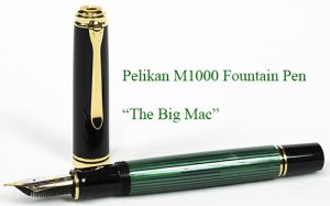
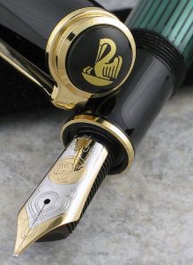
The Pelikan I’ve named in his honor is not as quiet as was James, and that’s a shame. The nib has an annoying habit of “singing” when I write in cursive. Beyond the screech, however, the pen is a joy to hold and pleasurably springy to write with, given the nib’s gold content and its massive size — the nib is the size of the last joint on my pinky finger.

I generally ink up the pen with a dark green ink to mirror its green barrel; currently I’m using Diamine’s Sherwood Forest ink. They work well together, but the pen also worked well with an antique Scrip Washable Blue ink so it appears the pen is easy to get along with.

I’m guessing James McCrie was the same way.

What’s in a Name?

An earlier post mentioned that I’m naming my best pens — the ones I’ll pass down to my children and grandchildren — after people important in my life.

First pen up is the “Leonard,” named for my father. It’s a Montegrappa Copper Mule fountain pen, and with it’s cap embossed with 1912 — the year of the Italian company’s founding — it seems only natural that it be named after my father, who was also born in 1912.

(Pen images are from the Clicky Post web site)

My father, Leonard Thomas Paul Schutze (let’s call him LT), was named after his uncle Leonard Paul Schutze (let’s call him LP so we don’t get them confused). LP was LT’s father’s older brother. (Okay, so I’m confused already.)

Leonard Thomas Schutze at work circa 1959

LP, in turn, was probably named for his grandfather, Johann Leonhard Schrotzberger, picking up his middle name. LP had a rather tragic life that merits a story all its own, but that’s for another post.

My dad’s birth certificate only shows one middle name, Thomas. I’m not sure when he was given the second middle name or if it was even official. But my speculation on the name Thomas is that it came from LT’s uncle Thomas Hutchings. Thomas was LT’s mother’s older half-brother, and he, too, merits a story of his own. He died about a year-and-a-half before my dad’s birth, and was a hero to LT’s mom, so I’m quite sure that’s where the middle name came from.

Parenthetically, my middle name is Thomas, as is my oldest son’s and my grandson’s. I’m definitely going to have to do a post on Thomas Hutchings in the future.

So, what about the pen? I bought it in 2016 and use it every day for journaling. It’s a metal pen, copper obviously, and has more weight than most fountain pens, but it’s well balanced in the hand and extremely comfortable to write with.

Being copper, the pen develops a patina over time, turning a dull brown. It can be polished to bring back the original brilliance, but that’s a bit more work than I’m willing to do, and it has a nice rustic look when left to age naturally.

The nib is steel, with an attractive crosshatch design. It writes with a good deal of scratchiness, rather like writing with a pencil. The brushed steel grip doesn’t slip in the fingers, and the nib’s fine tip delivers a clean line, something Leonard, a draftsman and engineer, would have appreciated.

The ink delivery system is either an ink cartridge or converter. I use the converter because I prefer bottled inks. The pen is currently filled with Pelikan’s 4001 Brilliant Brown whose color compliments that of the pen. I originally tried Diamine Ancient Copper ink, but the pen writes rather dryly, and the Diamine didn’t flow well enough.

Naming the pen Leonard provides a reminder of my dad every time I pick it up. If he were still alive, I would give him the pen as a gift, and I think he would have enjoyed using it. The next best thing will be passing it down to my son. My hope, of course, is that every time he picks it up he’ll be reminded of his grandfather Leonard Thomas.

Pets and Pens Can Become Family Members

Nope, I’m not a cat person, nor a dog person for that matter.

But give me a fountain pen and I’ll go as crazy as the neighborhood shut-in who has cats in every window and treats them better than family.

I peruse pen blogs much like some people watch cat videos. I find it curious that I’ve never found a blog in which pens have been named. We name pets, don’t we? We also name boats, and some people name their cars. But nobody seems to name their pens.

I’m out to rectify the matter.

The problem with fountain pens is that, like cats, they seem to multiply like crazy. Maybe that’s why people don’t name them, they couldn’t possibly remember all their names. Or maybe they know that once you name them you’ll never want to give them up, they become like family, and you don’t send family to the shelter (well, maybe some people do), and you don’t barter them away.

A warning: if you don’t want to become a pen collector, it’s best not to take one up and start writing with it. Once you do you’re hooked. A fountain pen feels great in the hand, and writing with one is as enjoyable and comforting as stroking the fur on your cat. Writing with a pencil isn’t bad, but it’s more like stroking a wire-haired dog. And writing with a ball point pen … that’s about as enjoyable as stroking your pet turtle.

So anyway, I’m going to name my pens, and I’m going to name them for people I admire: parents, grandparents, maybe a crazy uncle or great-aunt, and some people who are still around. When I use those pens, I’ll be reminded of the people who have given me great gifts: life, love, inspiration, lessons. And when the pens are ultimately passed down to the next generations, I hope the spirit of those named folk are rekindled every time the pens are used.

Stay tuned for future blogs in which we’ll write about both the pens and the people they’re named for. In the mean time, give kitty a rub for me.